Single Cell RNA-Seq Data is being generated at unprecedented rates due to increasingly affordable and easy-to-use technologies like 10x Genomics. Moreover, increasing accuracy, algorithms for integration that eliminate batch effects and user-friendly tools make single-cell experiments a valuable addition to research projects. But making data analysis intuitive, logical, and reproducible, is still a challenge. To address this challenge, Pine Biotech and the Tauber Bioinformatics Research Center have developed a user-friendly solution that allows:
- User-friendly utilization of the SEURAT package
- Selection of alternative integration & analysis methods
- Intuitive visual outputs in PDF or HTML formats
- Interactive Plotly dashboard with data and code
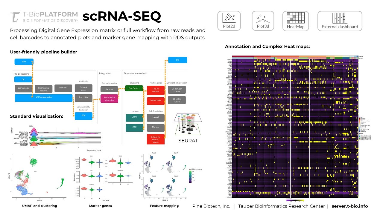
The standard approach to processing scRNA-Seq data has several inputs like barcodes, count matrix and features (genes). The data has to be “processed” – meaning it should be 1) Cleaned up, 2) Normalized, 3) Analyzed for highly variable features and adjusted for cell cycle heterogeneity. These methods have some variability, but they are made available through commonly used and updated packages like seurat (https://satijalab.org/seurat/index.html). The T-BioInfo platform allows users to build intuitive pipelines on a user-friendly interface that simplifies the process and eliminates the need for large amounts of RAM and processing power that single cell RNA-Seq data ultimately requires. In addition, the pipeline builder stores all variables in a reference file to make completed pipelines easier to reproduce.
scRNA-Seq Data Analysis and Visualization
There are several ways scRNA-Seq data can be summarized after processing. This includes UMAP or tSNE plots, summary statistics for cell types and marker genes that are characteristic of identified clusters. Many of these vary based on processing and integration steps as well as contain important insights into data reliability for interpretation.
To simplify visual exploration of these data, we assemble the table outputs into an interactive dashboard that can be used to explore associated features (cells by barcode), their position on a summary graph (UMAP or tSNE) and cluster IDs that are characterized by specific marker genes.
Cell Annotation and Marker Genes
Along with UMAP/tSNE plots, summary statistics, and marker genes. Single Cell Data Analysis on the T-Bioinfo Server also provides heatmaps and ridge plots highlighting differentially expressed genes for cells in each cluster compared to all other cluster cells. Not only this, but you can also visualize the expression levels through violin plots that are being generated to see the expression pattern across the clusters and feature plots for different lattice plots.
Finally integrating Celldex for human and mouse data researchers can obtain a collection of reference expression datasets. There’s also a possibility to manually annotate cell types for the clusters obtained based on the maker genes present. Interested to know more and get your data analyzed, feel free to contact us.